.png)
Think about a real home or business … What draws people in? From a welcome mat to windows, so many design and personalization elements create interest. The entryway of a home has the most traffic, but each room should have a purpose. Some of it can be seen from the outside, so of course, it’s important to pour your heart and soul into this particular space.
A website really isn’t much different. Your website is usually a client’s first look at who you are as a business into your brand. You want your homepage to be welcoming, easy to find and navigate, and each page within the site to provide information and be intentional. If your website is on the backburner but needs some love, it’s time to prioritize. Great design, mobile optimization, user experience, and lead generation are all pieces of a stellar website. Here’s why…
Good User-Experience (UX)
If you think about it, the design of your website is like the blueprint of a house. A blueprint covers everything from the square footage of rooms to where appliances should go. Blueprints are the first step in making sure the house is going to be livable.
User experience is crucial to a successful website design. Understanding how to leverage user experience tools is essential when it comes to making decisions about your site’s design and content. UX design moves people through the sales funnel.
The aesthetics of your website are often what set your company apart from the competition. Website first impressions are 94% design-related. This includes visual elements like layout, typography, font size, color schemes, clickability, imagery, and more. A well-designed website creates trust without overwhelming or overstimulating visitors. Visual elements outperform usability when it comes to first impressions, so it is important to invest in a strong design because it’s your first and, most of the time, only channel to directly connect with your clients. Stellar visual design leads to higher usability.
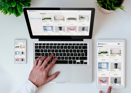
Optimizing mobile experiences for your clients is also becoming increasingly more important. If your website isn’t specifically optimized for smaller or mobile screens - you’re losing customers, plain and simple. A whopping 63 percent of Google's search traffic originates from mobile devices. As more and more of your brand’s first impressions continue to come from smartphones and other mobile devices, make sure to keep mobile design in mind when constructing your website.
Strong Calls-to-Action (CTAs)
Your audience isn’t looking for watered-down content, they want to find out what your company does, and how you can help them. If they find your website useful, they will use it for more information. Call-to-actions are great for directing your visitors throughout your website when they are ready to dive in. The visuals are just as important as the language when it comes to CTAs. The color, imagery, size, and placement all influence the experience of your audience; you want to highlight the proper visual weight for each area. White space isn’t always bad, you don’t want to overwhelm the viewer.
-
CTA Placement
Make sure your CTAs are positioned in front of the audience. Consider where visitors will likely see the CTAs, but where they’re also relative to the potential website user flow. As a broad rule of thumb, CTAs should be placed on pages “above the fold”, unless a location further down a page makes more sense with the content flow.

- CTA Design
Make your CTAs pleasing to the eye. CTA design should be bold to draw attention and increase click-throughs. Create buttons with contrasting colors and plenty of white space so that you are keeping CTAs visible and clickable. A hover effect can also improve UX so visitors know when they’ve found a button.
- CTA Language
If you successfully make a good first impression, you will start to build a successful brand, following, and community. Your site visitors are the people who become the best advocates of your business, commenters on social, and potential customers.
Site Strategy
As much as we all use the phrase, don’t judge a book by its cover, websites don’t necessarily carry the same ideology. It takes about 50 milliseconds (that’s 0.05 seconds - HALF A SECOND) for users to form an opinion about your website. This blink of an eye determines whether they feel your site is helpful, will get them what they’re looking for, and ultimately, whether they’ll stay or leave. Your site is subjected to a split-second perception because it is consistently being compared to other sites. The best way to get rid of split-second judgments on your homepage is to improve its design.
Improving the design of your site is a daunting task, but a good place to start is looking at your strategy. After all, a website without the right strategy is just throwing away resources. There are so many elements when it comes to website design, lead generation and content creation are just skimming the surface. So where on earth does one start?
Here are some keys to organizing your digital brand assets to create that stellar website your audience is dreaming of.
1. Value
Your value proposition is how you tell the world why they should care about your business, what you do, and the products and services you offer. Make your ‘Why’ clear, concise, and easy to follow. If your proposition is located at the bottom of the page, your visitor will leave the page before they even get to the good stuff. Keep in mind the simple element. Only use two to three sentences to capture the audience’s attention. Illustrate who you are and what you do in as few words as possible.
2. Personalization
Most buyers don’t want to be sold to. Good website design allows your audience to progress through the buyer’s journey at whatever pace is most comfortable for them. When they are ready they can become more personal with your brand. A good way to encourage them to continue through the buyer’s journey, without pressure, is through self-selection tools. These tools are any type of interactive features (forms, micro-yes selection, navigation levels, etc. These elements are great tools to guide your audience to the content that best matches their specific needs. Self-selection tools customize the experience of a website without the pressure of a sales pitch or unnecessary information. This can drastically help your brand sell itself and prevents you from overwhelming your audience.

3. Launching Content
One of the many benefits of having a website is having a place to publish and share content that positions you as a resource and thought leader. Don’t bury the content; make it easy to find, search, and share. Present new content through a mix of mediums like visual, audio, and written. Consistently rolling out new content helps your audience stay up to date with your brand and trust your brand as a reliable resource. Blogs, vlogs, and podcasts are a great way to emulate this.
4. Development Updates
Even if you already have a website up and running, it’s important to have a plan for continually updating the development and capabilities of your website. Much like a physical home, websites require maintenance. Don’t overlook the need to ‘tidy up’, make things more efficient, or optimize performance overall.
A business website, when designed effectively can act as, what They Ask, You Answer calls, your very “best salesman”. The best salespeople answer the questions you didn’t even know you had, and effective website content does the same. Your website is a tool for your customers to gain insight into your brand whenever they want, without having the pressure of talking to a salesperson. Your website’s functions, visuals, and overall feel (or user experience) serve as a direct look into your business. Your website is 95% of the first impression for your audience. All of these elements of first impressions - and design - determine how well your site is able to sell itself.